
Selected location rule
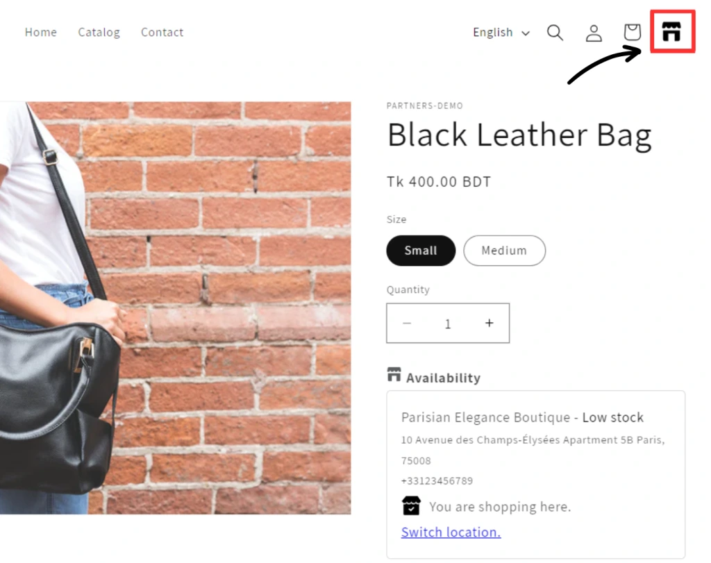
The Location Selection feature a.k.a. Location Rule, lets customers select a preferred store at the start of shopping. Once the preferred store is selected, the inventory available only at that location will be displayed. This will improve their shopping experience by providing accurate, location-specific inventory information. Note that customers can also easily switch their selected location at any time.
IMPORTANT: The Location rule feature requires theme customization and may not be suitable for all themes. We highly recommend testing the feature on a non-live theme first.
Accessing the feature
You can access it by clicking Location Rule in the Multi-location Inventory App.
Initial setup
A single-step setup is now included when you install the app on a new store. Click on the Setup rule button to initiate the process.
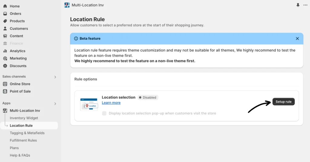
A single-step setup is now included when you install the app on a new store. Click on the Setup rule button to initiate the process.
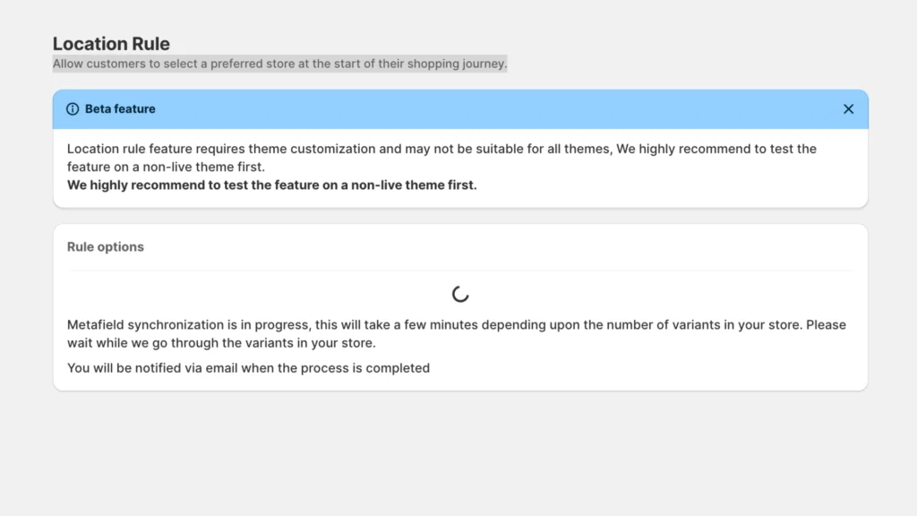
Note: If this takes longer without any progress, refresh your browser.
Rule options
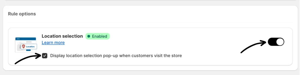
Once the sync is completed, you can now enable the feature and display the location selection pop-up when customers visit your store.
Note: The Text and Widget settings have a preview panel to show you how the storefront end would look as you make modifications.
Text
This setting allows you to modify text elements in the pop-up.
- Header Text: Customize the text displayed on the pop-up’s header.
- Placeholder Text: Customize the text displayed on the location dropdown.
- Description: (Optionally) display additional info on the pop-up.
- Sold out error message: Customize the sold-out error message. Use token {title} for product name
- Low stock error message: Customize the low stock error message. Use token {title} for the product name
Styles
This setting is for editing the pop-up’s appearance. You’ll need to provide your own CSS to customize the look of the pop-up.
Location settings
This is for editing the location info displayed on the pop-up.
- Excluded locations: If your inventory is out of stock at a specific location, select one or more locations to always exclude them from displaying stock information.
- Location display order: Drag and drop the locations to set the order in which they are displayed.
- Location display name: Customize the name of the location as it appears on product pages.
Widget settings
This setting allows for editing the product page widget settings further.
- Selected location label template: This setting provides a template for selected location information displayed on the product page widget. Copy and paste the “Default template value” into the box. You can modify “You are shopping at this location.” and “Change location” as needed. Below is the default template value:
You are shopping at this location. <br /> <a href="javascript:window.inventoryInfo.api.showLocationPicker(true)"> Change location </a>- Show selected location’s stock only: Use this option to display stock information for selected locations only. Only products from the chosen locations will appear in the pop-up.
- Hide inventory info widget: Use this setting to hide the inventory info widget on product pages.
- Hide dynamic buy now button: Buy now buttons will be disabled along with Add to Cart buttons, use this option to hide the buy now button instead.
- Cart form selector: This may be required if the app is not able to detect the Add to Cart button on your theme.
- Add to cart button selector: This may be required if the app is not able to detect the Add to Cart button on your theme.
- Sold out text: Specify the message to display when the app disables the Add to Cart button and shows the “sold-out” indicator based on rules or customer tags. You can enter any text you prefer to replace the default “sold out” message.
- Add to cart text: Enter the message to display when the app enables the “Add to Cart” button based on rules or customer tags, specifically when the products are in stock. You can specify any text you prefer to replace the default message.
- Text element selector: If the text of the “Add to Cart” button is enclosed within an HTML element, please specify the selector for that element (requires some HTML and CSS knowledge). Example: #AddToCartText
- Additional Info Message: Message to display below the widget when a purchase is blocked. Note that if the product is unavailable at a location, it will remain visible, but the inventory app will restrict product purchases.
Metafields
This setting is for synchronizing your inventory metafields. Perform a metafield update by clicking the Synchronize metafields button.
Shop online settings
The Shop Online settings enable customers to place orders using available stock from all store locations, rather than being restricted to just one. When the “Shop Online (All Locations)” checkbox is enabled, a new option appears in the location selector. Selecting this option removes the inventory restriction altogether.
How to enable:
Check the box labeled “Shop Online (All locations)” to activate the feature.
Enter a label for your “Online” location (e.g., “All Shops”)
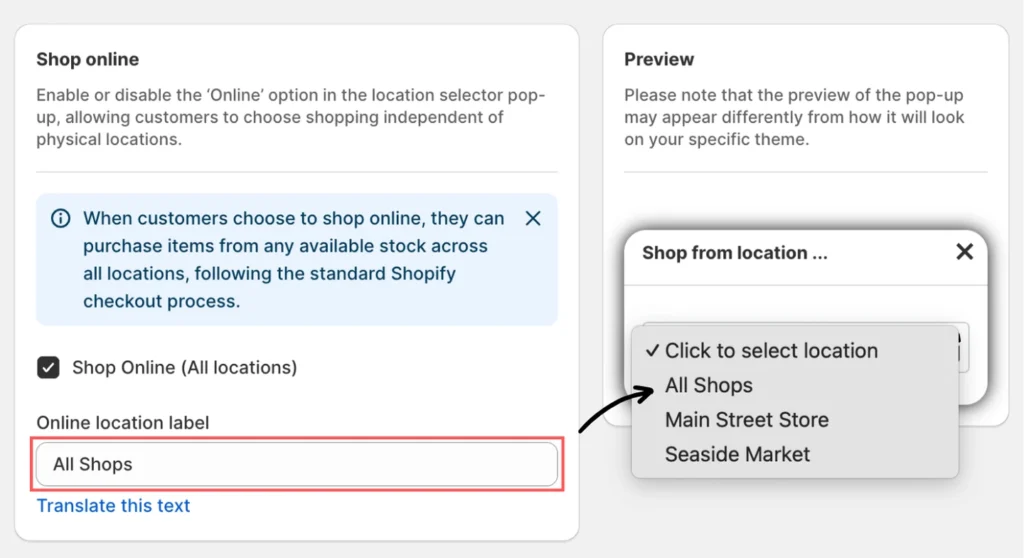
This will display the new option in the location selector pop-up along with physical store locations.
Additional How To’s
Set the location selection header icon
You can set a header icon for the location selection pop-up. To set it, please follow the guide below:
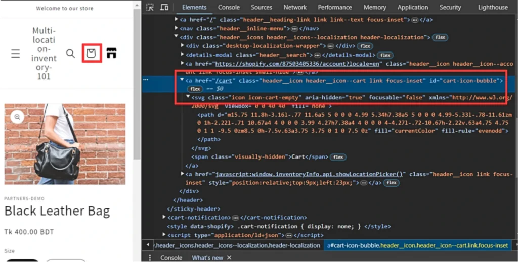
Step 1: Click on the right button and inspect the cart icon.
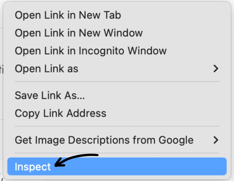
Step 2: Copy the class associated with the cart icon.
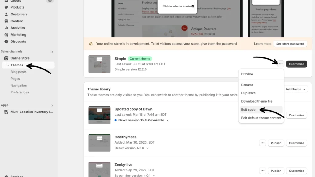
Step 3: From Sales channels > Online Store, go to Themes. Click the three-dot menu button beside “Customize” > Edit code for the published theme.
Step 4: In the code editor screen, do the following:
- Use the Filter files search box to locate “header.liquid”.
- Press Ctrl + F to open the search field. (Command + F on a Mac)
- Paste the copied class into the search field and click Next to locate its code section.
- Insert the following header icon code below the cart icon’s existing code section:
Sample Code:
<a href="javascript:window.inventoryInfo.api.showLocationPicker()" class="header__icon link focus-inset" style="position:relative;top:9px;left:23px;">
  <svg viewBox="0 0 36 36" xmlns="http://www.w3.org/2000/svg">
    <path d="M1.791 2.253l-.597 3.583A1 1 0 002.18 7h.893a1.5 1.5 0 001.342-.83L5 5l.585 1.17A1.5 1.5 0 006.927 7h1.146a1.5 1.5 0 001.342-.83L10 5l.585 1.17a1.5 1.5 0 001.342.83h1.146a1.5 1.5 0 001.342-.83L15 5l.585 1.17a1.5 1.5 0 001.342.83h.893a1 1 0 00.986-1.164l-.597-3.583A1.5 1.5 0 0016.729 1H3.271a1.5 1.5 0 00-1.48 1.253z" fill="#000"></path>
    <path d="M18 9H2v8.5A1.5 1.5 0 003.5 19H7v-7h6v7h3.5a1.5 1.5 0 001.5-1.5V9z" fill="#00"></path>
  </svg>
</a>
Change the icon color
Step 1: Locate the fill attribute within the <path> tags of the SVG code.
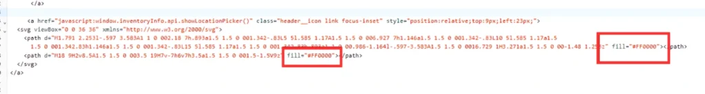
Step 2: Replace the existing hex code with your desired color’s hex code.
Demo site
Use the information provided below to access the demo site to see this configuration upfront:
- Site: https://location-selection.myshopify.com/
- Password: test
If you have any questions or concerns, don’t hesitate to contact our support team.